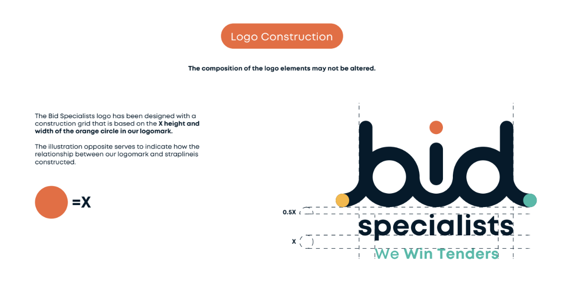
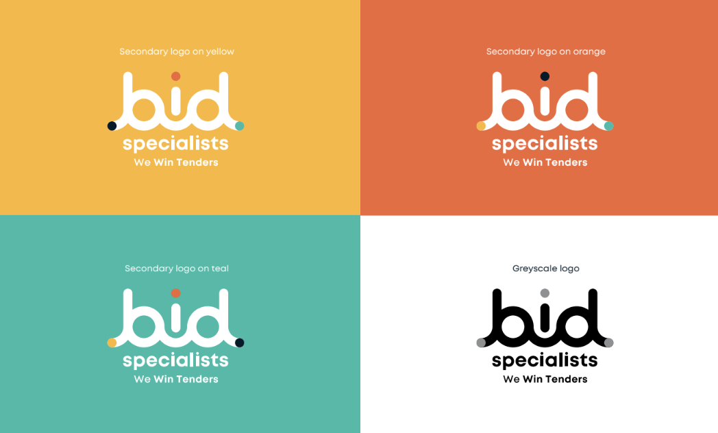
As part of the brand overhaul for Bid Specialists, we meticulously reconstructed their logo to ensure consistency, visibility, and impact across all forms of media. The logo needed to be clean, professional and eye-catching. The Madcraft team created a custom font for the ‘bid’ script, incorporating three colored dots which represent the three primary services that Bid Specialists provide — Bid Prep, Bid Manage, and Bid Consult.
Primary Logos for Core Brand Collateral:
For all primary brand collateral—including business cards, letterheads, PowerPoint presentations, banners, and e-brochures— we recommended that the full version of the logo, complete with the “We Win Tenders” strapline, be used. The inclusion of the strapline reinforces Bid Specialists’ core message and strengthens brand recognition. Whether it’s on printed material or digital platforms, the logo’s presence should be clear, impactful, and always accompanied by the appropriate spacing rules.
Adaptations for Secondary Brand Collateral:
On secondary brand collateral, such as business invoices and internal documents, the logo can be used without the “We Win Tenders” strapline. This applies to both the primary stacked and horizontal logos. The flexibility to drop the strapline ensures that the logo adapts to more minimalistic applications while maintaining the core visual identity.


